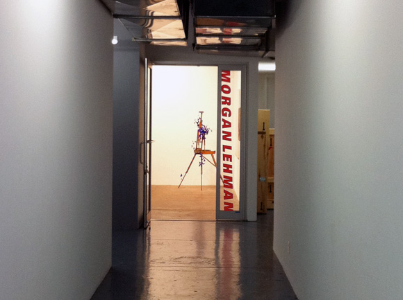
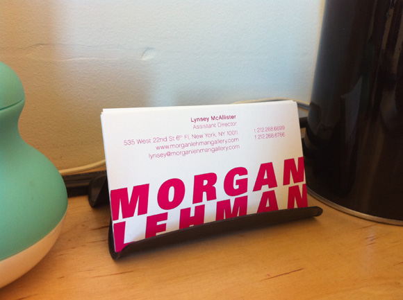
Morgan Lehman Gallery rebranding
My favorite art client, Morgan Lehman Gallery, wanted to update their branding as they were moving to a new space and representing a slew of hot young artists. I always had a soft spot for their branding as it was bright pink – CMYK 0/100/0/0 – but like most NYC gallery logos it was just a skinny wordmark k e r n e d v e r y w i d e, so because I’m really a genius I kept the pink the same and used a big fat italic font, tweaked it, pushed it so far into the corners it fell off the page and kerneditverytight. That’s it folks. That’s how branding works. I’m off surfing. [I'll post some non-iphone pics soon]
 before/after logos

